PROJECT
Holiday Search Results
This was the results page when a user submitted the search form, either on the home page or in the header.
ISSUES:
-
Search results were pushed down the page with superfluous information.
-
A holiday deal at the top of search results could lead the user to a completely different part of the site.
-
Each hotel would show many deals associated with it, which limited users' ability to compare.
-
The layout was poor, results were spaced out and misaligned.
Previous design

PHASE ONE DESIGNS

Changes made:
-
Multiple iterations to arrive at this design, all A/B tested.
-
Thinner deal row allowing more deals per page without hiding information.
-
Whole row with exception of info link is hyperlinked to deal - increased click-ability.
-
Price next to CTA.
-
Remove red colour from 'show more' - remove conflict with CTA.
-
Remove phone numbers - drive all conversions through click.

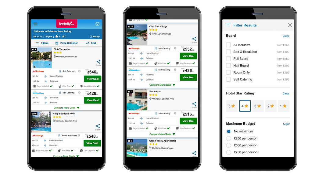
PHASE TWO DESIGNS
-
Refined filters, price calendar and sort on mobile & tablet.
-
Added USPs for providers (Bag included, Free Transfers, etc).
-
Reduced number of deals per hotel - 'compare more' added to reveal more.
-
Redesigned filters to be digit-friendly on mobile.
-
Introduced brand changes.
-
CTAs changed from red to green.